
How I Made My Blog Logo with ChatGPT
From a generic </> icon to a Z with a color-shifting cursor: how I generated concepts in ChatGPT, compared them at real sizes and finished the mark as an SVG.
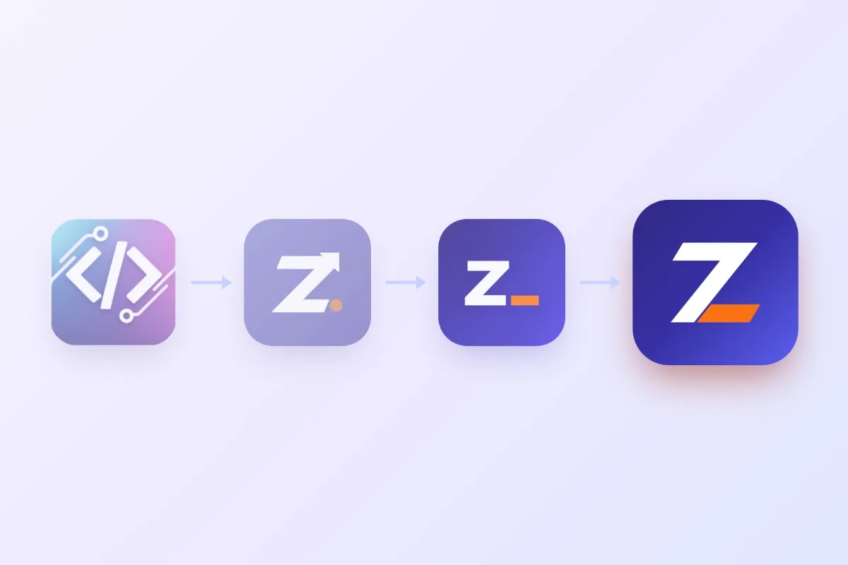
For a long time this blog’s logo was the standard </> icon on a gradient - the kind half of all developer sites use. It said nothing about me or the blog. I decided to replace it, but I’m not a designer, so I took this route: generate ideas in ChatGPT, then take them to production myself together with an AI coding assistant.
First - where the logo lives
Before generating anything, it’s worth understanding where the mark will appear. In my case:
- a 28-48 px icon in the header, footer and admin, next to the site name;
- a 16-32 px favicon in the browser tab;
- a home-screen icon on iOS and Android.
So the mark has to read at 16 pixels. That immediately rules out anything complex: small details, thin lines, text. I spelled this out in every prompt, along with the site colors (indigo with an orange accent), the format (a square with the background edge to edge) and a ban on text and mockups.
First attempt
ChatGPT’s first suggestion was a Z whose diagonal turns into a growth arrow, with an orange dot. It looked neat, and I even put it on the site. But it read like yet another startup “growth” logo, so I wanted to compare it with something else.
Four concepts
So I asked for several fundamentally different ideas in a single conversation - that way ChatGPT keeps the shared requirements and you don’t have to repeat the context every time:
- “Terminal” - a Z and an orange cursor, like
Z_in a console; - “Path” - a Z drawn as one line from start to goal;
- “Folded ribbon” - an origami Z with an orange diagonal;
- “Negative space” - a Z cut out of an indigo shape on an orange background.
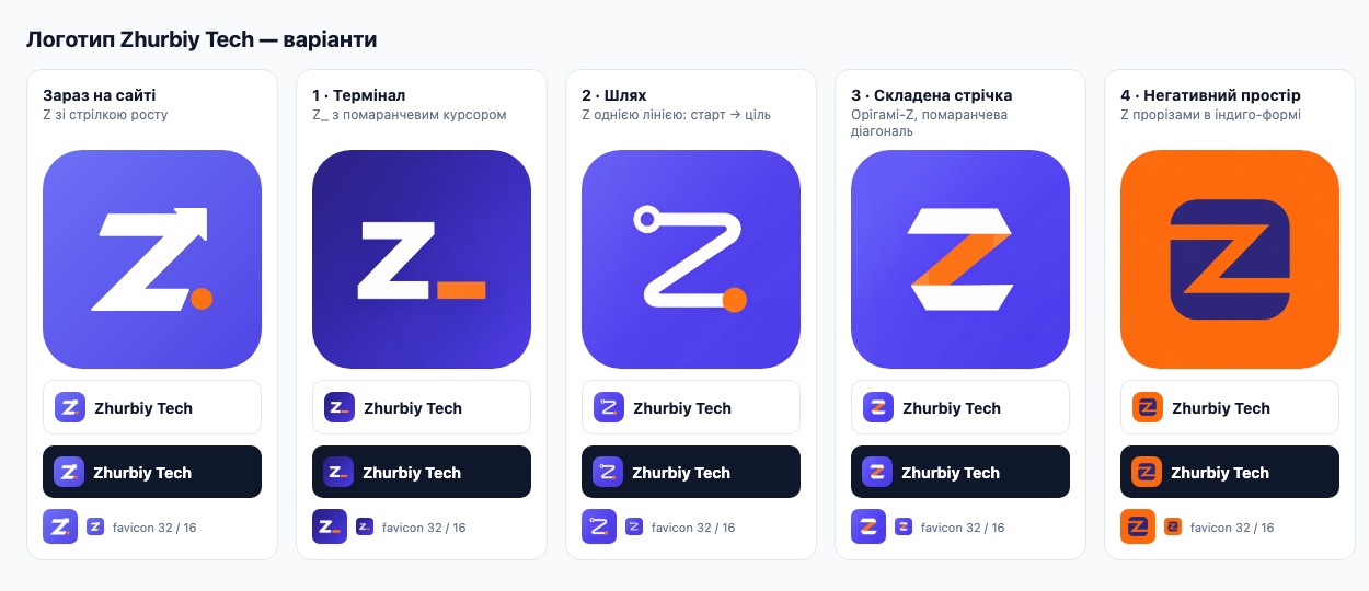
The main takeaway from this stage: comparing logos at a large size is almost useless. I put together a simple HTML page showing each option large, in the header on light and dark themes, and as a 32 and 16 px favicon. That’s where it became obvious that “Path” with its thin line simply dissolves at 16 px, and “Negative space” clashes with the site colors.
“Simple and boring”
I liked “Terminal” the most: it’s the clearest at any size and it’s literally about development. But the feedback I got when I showed it was honest: too simple and boring. So I went for a second round - the same Z and cursor, but with more character:
- A - the cursor built into the letter: the bottom bar of the Z is the orange cursor;
- B -
Z_inside a terminal window with three dots; - C - a gradient Z with a glowing accent (here ChatGPT ignored the request and drew an asterisk instead of a cursor - it happens);
- D - the classic
Z_with a blinking cursor.
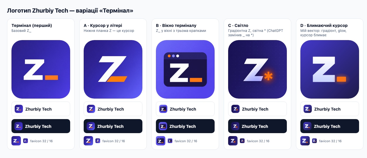
At 28 px the terminal window turned into mush, while option A turned out to be both simple and clever. That’s the one I picked, borrowing the animation idea from D.
Why you can’t just use the PNG from ChatGPT
The generated image is a 1254×1254 raster with small artifacts: slightly uneven edges, slants that should match but don’t quite. You can’t see it at 28 px, but I wanted a logo to be precise. So I redrew the mark as SVG: two shapes, parallel slants, equal bar heights. The file is under a kilobyte and crisp at any size.
From that SVG I generated all the icons: favicon.svg, favicon.ico (16/32/48), apple-touch-icon and the Android icons. Headless Chrome was enough for rendering - no graphics editors involved.
A cursor that doesn’t turn the Z into a 7
I built the animation right inside the SVG with CSS - it works even when the file is loaded as a regular <img>. At first the cursor simply blinked, like in a terminal. And then a funny problem showed up: when the bottom bar disappears, the Z briefly reads as a 7.
I tried several options - breathing, glow, a shine sweep, flickering between two shades of orange - and settled on the simplest: the bar doesn’t disappear, it smoothly turns white. For a moment the whole Z is white, and then the cursor “lights up” orange again.
.c { animation: c 2.4s ease-in-out infinite }
@keyframes c {
  0%, 35% { fill: #f97316 }
  50%, 85% { fill: #fff }
  100% { fill: #f97316 }
}
@media (prefers-reduced-motion: reduce) {
  * { animation: none !important }
}
The last rule matters: if someone has reduced motion turned on in their system, the logo just stays still.
A surprise after deploying
The commit deployed, but the site still showed the old logo. Railway reported a successful deploy and the server was serving the new file, but between it and the browser sits Cloudflare, which had cached static files for four hours.
I could have gone into the Cloudflare dashboard and purged the cache, but I’d have to do that after every change. I did something simpler - added a version to the logo and icon paths:
const BRAND_ASSETS_VERSION = '3'
// ...
siteLogoUrl: `/logo.svg?v=${BRAND_ASSETS_VERSION}`
To the cache it’s a new URL, so the fresh file is picked up right away. Change the logo - bump the version.
What I took away
- ChatGPT is good at generating concepts, but it’s better to finish the final logo as a vector yourself.
- Compare options at real sizes and in real context, not as big pictures.
- Ask for several concepts in one conversation: the shared requirements don’t get lost.
- An outside view helps: one honest “boring” was worth more than a few more generations.
- A logo animation should be unobtrusive and switch off for people who are bothered by motion.
- Don’t forget about caching: a CDN can easily hide your own deploy from you.
Comments 0
to post
No comments yet. Be the first to share your thoughts.